Having the ability to create a pie chart in Excel will aid you in reading and deciphering data in any diagram. A pie chart is basically a circular graph in which circular sectors in different sizes represent numerical proportions. The 360 degree pie chart is used by many people simply because of its ability to show quantities clearly, and that it is easy to read even when shown on a computer screen.
The Excel Pie Chart is one of the most popular templates created for Microsoft Excel. There are various types of charts that Excel provides, so people can easily understand the data. Pie Charts show how much each constituent makes up the whole in each segment. Information shown using Pie Charts can be easily understood by all types of users, no matter how much or how little skill they have in data processing.
Table of Contents
How to Create Pie Chart in Excel
Part 1: Adding Data
- Open Microsoft Excel. It resembles a white “E” on a green background.
- If you would rather make a chart from data you already have, double-click the Excel document that contains the data to open it and proceed to the next section.
- Click Blank workbook (PC) or Excel Workbook (Mac). It’s in the top-left side of the “Template” window.
- Add a name to the chart. To do so, click the B1 cell and then type in the chart’s name.
- For example, if you’re making a chart about your budget, the B1 cell should say something like “2017 Budget”.
- You can also type in a clarifying label–e.g., “Budget Allocation”–in the A1 cell.
- Add your data to the chart. You’ll place prospective pie chart sections’ labels in the A column and those sections’ values in the B column.
- For the budget example above, you might write “Car Expenses” in A2 and then put “$1000” in B2.
- The pie chart template will automatically determine percentages for you.
- Finish adding your data. Once you’ve completed this process, you’re ready to create a pie chart using your data.
Part 2: Creating a Chart
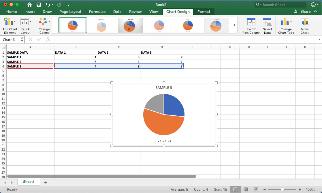
- Select all of your data. To do so, click the A1 cell, hold down ⇧ Shift, and then click the bottom value in the B column. This will select all of your data.
- If your chart uses different column letters, numbers, and so on, simply remember to click the top-left cell in your data group and then click the bottom-right while holding ⇧ Shift.
- Click the Insert tab. It’s at the top of the Excel window, just right of the Home tab.
- Click the “Pie Chart” icon. This is a circular button in the “Charts” group of options, which is below and to the right of the Insert tab. You’ll see several options appear in a drop-down menu:
- 2-D Pie – Create a simple pie chart that displays color-coded sections of your data.
- 3-D Pie – Uses a three-dimensional pie chart that displays color-coded data.
- Click an option. Doing so will create a pie chart with your data applied to it; you should see color-coded tabs at the bottom of the chart that correspond to the colored sections of the chart itself.
- You can preview options here by hovering your mouse over the different chart templates.
- Customize your chart’s appearance. To do so, click the Design tab near the top of the “Excel” window, then click on an option in the “Chart Styles” group. This will change the way your graph looks, including the color schemes used, the text allocation, and whether or not percentages are displayed.
- To view the Design tab, your chart must be selected. You can select a chart by clicking it.
Formatting the Pie Chart in Excel
There are a lot of customizations you can do with a Pie chart in Excel. Almost every element of it can be modified/formatted.Pro Tip: It’s best to keep your Pie Charts simple. While you can use a lot of colors, keep it to a minimum (even different shades of the same color is fine). Also, if your charts are printed in black and white, you need to make sure the difference in slice colors is noticeable.
Let’s see a few of the things that you can change to make your charts better.
Changing the Style and Color
Excel already has some neat pre-made styles and color combinations that you can use to instantly format your Pie charts.
When you select the chart, it will show you the two contextual tabs – Design and Format.https://a14804c29c2b8c1cb3baeaf1549ff5dc.safeframe.googlesyndication.com/safeframe/1-0-38/html/container.html

These tabs only appear when you select the chart
Within the ‘Design’ tab, you can change the Pie chart style by clicking on any of the pre-made styles. As soon as you select the style that you want, it will be applied to the chart.

You can also hover your cursor over these styles and it will show you a live preview of how your Pie chart would look when that style is applied.
You can also change the color combination of the chart by clicking on the ‘Change Colors’ option and then selecting the one you want. Again, as you hover the cursor over these color combinations, it will show a live preview of the chart.

Pro Tip: Unless you want your chart to be really colorful, opt for the monochromatic options. These have shades of the same color and are relatively easy to read. Also, in case you want to highlight one specific slice, you can keep all the other slices in dull color (such as grey or light blue) and highlight that slice with a different color (preferably bright colors such as red or orange or green).
Formatting the Data Labels
Adding the data labels to a Pie chart is super easy.
Right-click on any of the slices and then click on Add Data Labels.

As soon as you do this. data labels would be added to each slice of the Pie chart.

And once you have added the data labels, there is a lot of customization you can do with it.
Quick Data Label Formatting from the Design Tab
A quick level of customization of the data labels is available in the Design tab, which becomes available when you select the chart.
Here are the steps to format the data label from the Design tab:
- Select the chart. This will make the Design tab available in the ribbon.
- In the Design tab, click on the Add Chart Element (it’s in the Chart Layouts group).

- Hover the cursor on the Data Labels option.

- Select any formatting option from the list.
One of the options that I want to highlight is the ‘Data Callout’ option. It quickly turns your data labels into callouts as shown below.

More data label formatting options become available when you right-click on any of the data labels and click on ‘Format Data Labels.

This will open a ‘Format Data Labels’ pane on the side (or a dialog box if you’re using an older version of Excel).
In the Format Data Labels pane, there are two sets of options – Label Options and Text Options

Formatting the Label Options
You can do the following type of formatting with the label options:
- Give a border to the label(s) or fill the label(s) box with a color.
- Give effects such as Shadow, Glow, Soft Edges, and 3-D Format.
- Change the size and alignment of the data label
- Format the label values using the Label options.

I recommend keeping the default data label settings. In some cases, you may want to change the color or the font size of these labels. But in most cases, the default settings are fine.
You can, however, make some decent formatting changes using the label options.
For example, you can change the placement of the data label (which is ‘best fit’ by default) or you can add the percentage value for each slice (which shows how much percentage of the total does each slice represents).
Formatting the Text Options
Text Options formatting allows you to change the following:
- Text Fill and outline
- Text Effects
- Text box

In most cases, the default settings are good enough.
The one setting you may want to change is the data label text color. It’s best to keep a contrasting text color so it’s easy to read. For example, in the below example, while the default data label text color was black, I changed it to white to make it readable.

Also, you can change the font color and style by using the options in the ribbon. Just select the data label(s) you want to format and use the formatting options in the ribbon.
Formatting the Series Options
Again, while the default settings are enough in most cases, there are few things you can do with ‘Series Options’ formatting that can make your Pie charts better.
To format the series, right-click on any of the slices of the Pie chart and click on ‘Format Data Series’.

This will open a pane (or a dialog box) with all the series formatting options.
The following formatting options are available:
- Fill & Line
- Effects
- Series Options

Now let me show you some minor formatting that you can do to make your Pie chart look better and more useful for the reader.
- Highlight one slice in the Pie Chart: To do this, uncheck the ‘Vary colors by slice’ option. This will make all the slices of the same color (you can also change the color if you want). Now you can select one of the slices (the one that you want to highlight) and give it a different color (preferably a contrasting color, as shown below)

- Separate a slice to highlight/analyze: In case you have a slice that you want to highlight and analyze, you can use the ‘Point Explosion’ option in the Series option tab. To separate a slice, simply select it (make sure only the slice that you want to separate from the remaining pie is selected) and increase the ‘Point Explosion’ value. It will pull the slice slightly from the rest of the Pie Chart.

Formatting the Legend
Just like any other chart in Excel, you can also format the legend of a Pie chart.
To format the legend, right-click on the legend and click in Format Legend. This will open the Format Legend pane (or a dialog box)

Within the Format Legend options, you have the following options:
- Legend Options: This will allow you to change the formatting such as fill color and line color, apply effects, and change the position of the legend (which allows you to place the legend at the top, bottom, left, right and top right).
- Text Options: These options allow you to change the text color and outline, text effects, and the text box.
In most cases, you don’t need to change any of these settings. The only time I use this is when I want to change the position of the legend (place it on the right instead of the bottom).
Pie Chart Pros and Cons
Although Pie charts are used a lot in Excel and PowerPoint, there are some drawbacks about it that you should know.
You should consider using it only when you think it allows you to represent the data in an easy to understand format and adds value for the reader/user/management.
What’s Good about Pie Charts
- Easy to create: While most of the charts in Excel are easy to create, pie charts are even easier. You don’t need to worry a lot about customization as most of the times, the default settings are good enough. And if you need to customize it, there are many formatting options available.
- Easy to read: If you only have a few data points, Pie charts can be very easy to read. As soon as someone looks at a Pie chart, they can figure out what it means. Note that this works only if you have a few data points. When you have a lot of data points, the slices get smaller and become hard to figure out
- Management loves Pie Charts: In my many years of corporate career as a financial analyst, I have seen the love managers/clients have for Pie charts (which is probably only trumped by their love for coffee and PowerPoint). There have been instances, where I have been asked to convert bar/column charts into Pie charts (as people find it more intuitive).
If you’re interested, you can also read this article by Excel charting expert Jon Peltier on why we love pie charts (disclaimer: he doesn’t)
What’s Not so Good About Pie Charts
- Useful Only with fewer data points: Pie charts can become quite complex (and useless to be honest) when you have more data points. The best use of a Pie chart would be to show how one or two slices are doing as a part of the overall pie. For example, if you have a company with five divisions, you can use a Pie chart to show the revenue percent of each division. But if you have 20 divisions, it may not be the right choice. Instead, a column/bar chart would be better suited.
- Can’t show a trend: Pie charts are meant to show you the snapshot of the data in a given point in time. If you want to show a trend, better use a line chart.
- Can’t show multiple types of data points: One of the things I love about Column charts is that you can combine it with a line and create combination charts. A single combination chart packs a lot more information than a plain Pie chart. Also, you can create actual vs target charts which are a lot more useful when you want to compare data in different time periods. When it comes to a Pie chart, you can easily replace it with a line chart without losing out on any information.
- Difficult to comprehend when the difference in slices is less: It’s easier to visually see the difference in a column/bar chart as compared with a Pie chart (especially when there are a lot of data points). In some cases, you may want to avoid these as they may be a bit misleading.
- Takes more space and gives less information: If you’re using Pie charts in reports or dashboards (or in PowerPoint slides) and want to show more information in less space, you may want to replace it with other chart types such as combination charts or bullet chart.
Conclusion
Nowadays, creating charts is a simple and straightforward task, thanks to all of the tools and plugins that we have available. And if we want to create our own chart with our own design, there are even more options. However, back in the day when Excel was released, its developer probably didn’t anticipate how popular it would become as a spreadsheet program. He probably also never thought about how people would want to customize their charts and make them as beautiful as can be!