In this post, we will discuss how to create graphs in Excel. Comprehending graphs is not as hard as it seems. Although most people find it difficult to understand graphs. Learning how to create graphs in Excel makes it easier for you to grasp the data displayed on the graph.
Microsoft Excel’s spreadsheets work intuitively, forming charts and graphs from selected data. You can make a graph in Excel to increase the efficacy of your reports. This article teaches you how to create a graph or chart in Microsoft Excel. You can create a graph from data in both the Windows and the Mac versions of Microsoft Excel.
Table of Contents
Method 1 On Windows
Part 1 Gathering Data
Open your Excel program. Its app icon resembles a green box with a white “X” on it.
Click on the File menu to open an existing spreadsheet or start a new spreadsheet.
Enter the data. Typing in a data series requires you to organize your data. For most people, you will enter items in the first column, Column A, and enter the variables for each individual item in the following columns.
- For example, if you are comparing the sales results of certain people, the people will be listed in Column A, while their weekly, quarterly and yearly sales results might be listed in the following columns.
- Keep in mind that on most charts or graphs, the information in Column A will be listed on the x axis, or horizontal axis. However, in the case of bar graphs, the individual data automatically corresponds to the y axis, or vertical axis.
Use formulas. Consider totaling your data in the last column and/or last rows. This is essential if you are using a pie chart that requires percentages.
- To enter a formula in Excel, you highlight data in a row or column. Then, you click on the Function, fx, button and choose a type of formula, such as a sum.
Type in a title for the spreadsheet/graph using the first rows. Use headings in the second row and column to explain your data.
- Titles will be transferred to the graph when you create it.
- You can enter your data and headings into any section of the spreadsheet. If you are making a graph for the first time, you should aim to keep the data within a small area so it is easy to work with.
Save your spreadsheet before continuing.
Part 2 Inserting Your Graph
Highlight the data that you have just entered. Drag your cursor from the top left heading to the bottom right corner of the data.
- If you want a simple graph explaining only 1 data series, you should only highlight the information in the first column and the second column.
- If you want to make a graph with several variables to show trends, highlight several variables.
- Make sure you highlight the headers in the Excel 2010 spreadsheet.
Select the Insert tab on the top of the page. In Excel 2010, the Insert tab is located between the Home and Page Layout tabs.
Click on “Charts.” Charts and graphs are both available in this section and are used somewhat interchangeably as visual representations of spreadsheet data.
Choose a type of chart or graph. Each type has a small icon next to it explaining what it will look like.
- You can return to this chart menu to choose a different graph option as long as the graph is highlighted.
Hover your mouse over the graph. Right click with your mouse and choose “Format Plot Area.”
- Scroll through the choices in the left hand column, such as border, fill, 3-D, glow and shadow.
- Reformat the look of the graph by selecting colors and shadows according to your preferences.
Part 3 Choosing Your Graph Type
Insert a bar graph, if you are comparing several correlated items with a few variables. The bar for each item can be either clustered or stacked depending upon how you want to compare the variables.
- Each item on the spreadsheet is listed separately in a single bar. There are no lines connecting them.
- If you are using our previous example with weekly, quarterly and yearly sales, you can create a different bar in a different color for each individual. You can choose whether to have the bars side by side or condensed into a single bar.
Choose a line graph. If you want to plot data over time, this is the best way to show how a data series has changed over time, such as in days, weeks or years.
- Each piece of data in your series will be a dot on your line graph. The lines will connect these dots to show changes.
Select a scatter graph. This type of graph is similar to a line graph because it plots data on an x/y axis. You can choose to leave the data points unconnected in a marked scatter graph or connect them with smooth or straight lines.
- The scatter graph is perfect for plotting many different variables on the same chart, allowing the smooth or straight lines to intersect. You can easily show trends in data.
Opt for a chart. Surface charts are great for comparing 2 sets of data, area charts show changes in magnitude and pie charts show percentages of data.
Method 2 On Mac
Open Microsoft Excel. Its app icon resembles a green box with a white “X” on it.
Click Blank workbook. It’s a white box in the upper-left side of the window.
Consider the type of graph you want to make. There are three basic types of graph that you can create in Excel, each of which works best for certain types of data:
- Bar – Displays one or more sets of data using vertical bars. Best for listing differences in data over time or comparing two similar sets of data.
- Line – Displays one or more sets of data using horizontal lines. Best for showing growth or decline in data over time.
- Pie – Displays one set of data as fractions of a whole. Best for showing a visual distribution of data.
Add your graph’s headers. The headers, which determine the labels for individual sections of data, should go in the top row of the spreadsheet, starting with cell B1 and moving right from there.
- For example, to create a set of data called “Number of Lights” and another set called “Power Bill”, you would type Number of Lights into cell B1 and Power Bill into C1
- Always leave cell A1 blank.
Add your graph’s labels. The labels that separate rows of data go in the A column (starting in cell A2). Things like time (e.g., “Day 1”, “Day 2”, etc.) are usually used as labels.
- For example, if you’re comparing your budget with your friend’s budget in a bar graph, you might label each column by week or month.
- You should add a label for each row of data.
Enter your graph’s data. Starting in the cell immediately below your first header and immediately to the right of your first label (most likely B2), enter the numbers that you want to use for your graph.
- You can press the Tab ↹ key once you’re done typing in one cell to enter the data and jump one cell to the right if you’re filling in multiple cells in a row.
Select your data. Click and drag your mouse from the top-left corner of the data group (e.g., cell A1) to the bottom-right corner, making sure to select the headers and labels as well.
Click the Insert tab. It’s near the top of the Excel window. Doing so will open a toolbar below the Insert tab.
Select a graph type. In the “Charts” section of the Insert toolbar, click the visual representation of the type of graph that you want to use. A drop-down menu with different options will appear.
- A bar graph resembles a series of vertical bars.
- A line graph resembles two or more squiggly lines.
- A pie graph resembles a sectioned-off circle.
Select a graph format. In your selected graph’s drop-down menu, click a version of the graph (e.g., 3D) that you want to use in your Excel document. The graph will be created in your document.
- You can also hover over a format to see a preview of what it will look like when using your data.
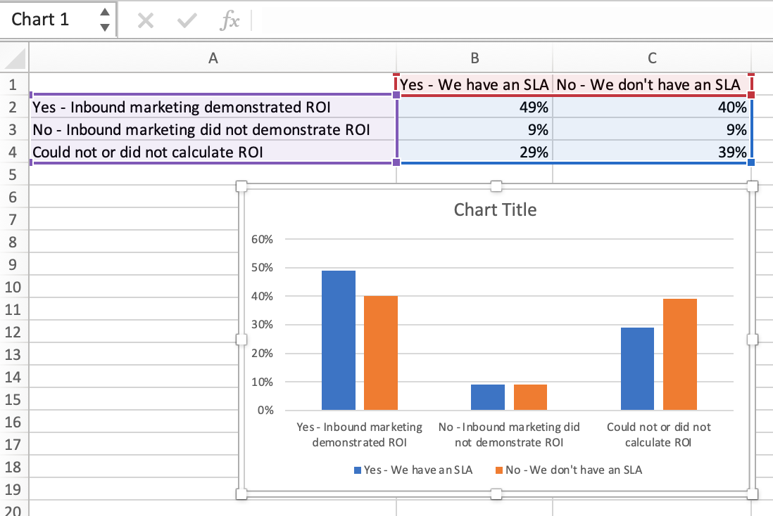
Add a title to the graph. Double-click the “Chart Title” text at the top of the chart, then delete the “Chart Title” text, replace it with your own, and click a blank space on the graph.
- On a Mac, you’ll instead click the Design tab, click Add Chart Element, select Chart Title, click a location, and type in the graph’s title.
Save your document. To do so:
- Mac – Click File, click Save As…, enter the document’s name in the “Save As” field, select a save location by clicking the “Where” box and clicking a folder, and click Save.
Conclusion
Creating graphs in Excel isn’t as hard as it might sound initially. It’s actually pretty straightforward once you understand the basic functions of how to create a graph. There are lots of applications for creating graphs in Excel, but typically they are used for analyzing financial data or scientific data.