How to Create Infographics – Infographics are visual representations of information, data, or knowledge. The purpose of an infographic is to present information quickly and clearly via a visual medium to the user. In the article, we will take a look at some useful tools that can help designers create an infographic from scratch.
What is infographic creators? The Infographic creator is a free tool to create infographic. These tools can be used by designers, students, business owners, and many more. Infographic is gaining more popularity among digital marketers for brand awareness and lead generation. So get your free tools to create infographics here.
Good infographics tell their own story. But a well-designed infographic can do more than that—it can swell into a fascinating visual essay that provides new insight into a subject that goes beyond your original thought.
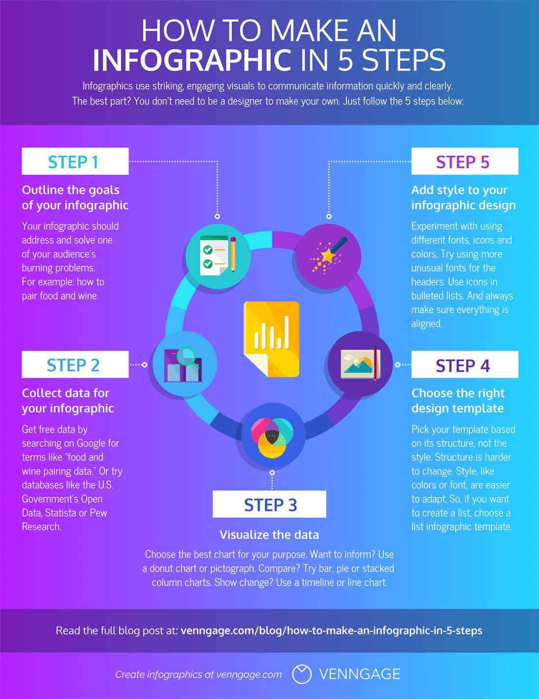
Here are the 7 steps we will follow:
- Step 1: Define your audience
- Step 2: Define your goals
- Step 3: Gather your information
- Step 4: Choose a type of infographic
- Step 5: Create a logical hierarchy in your data
- Step 6: Pick and customize a template that fits your message
- Step 7: Download, share or embed your infographic
And if you prefer to watch instructions instead of reading them, below you can find a video summary of this blog post.https://www.youtube.com/embed/NR-AtpwIXuU?feature=oembed
Ok. Ready?
Before we get started, let’s clear something up:
Table of Contents
Infographics are about communication, not design
People often overemphasize design in infographics. They add a ton of different fonts & colors, cram in all the latest design trends, and use a bunch of icons. Then they wonder why no one gets the message. Don’t get me wrong, design is important, but not in the way you think it is.
Design gives your content an extra dimension. It conveys the emotional aspect behind a message that is otherwise hard to put into words. For example:
Let’s say your company has a secret Santa event coming up and you want to make sure everyone knows it’s not about buying expensive gifts. You can do two things:
- Send out an email outlining the do’s and dont’s of gift-giving
- Create an infographic that goes through the same information but in a visual way

Sending a plain email is boring and makes it less likely that people will read the message. A well-crafted infographic, on the other hand, not only sends the message but also communicates that it’s supposed to be fun.
Now that we’ve got that out of the way. Let’s start creating an infographic.
Step 1: Define your audience
When you try to please everyone, you end up pleasing no one.
Similarly, if you try to create an infographic that’s interesting for everyone, it’s going to end up not being interesting for anyone.
Part of making a good infographic is deciding who it is for and—equally as important—who it is not for. Who your target audience is will determine what data you use, how much lingo and jargon you can get away with, what the overall style of the infographic will be, and in what detail you need to explain everything.
Ask yourself the following questions:
Is your target audience internal or external?
When you create an infographic for internal audiences, you can skip over basic information. You don’t have to explain the basics to your colleagues who have been working on the same thing for months. When your audience is external, however, you have to set the stage before you explain the details.
What’s your target audience’s position?
An infographic aimed at executives will be different than an infographic aimed at interns. The higher up you go in an organization, the more strategic things become and your infographic will have to reflect that.
What level of knowledge do they have?
When your audience consists of experts, you can safely assume they understand the lingo associated with your field. You can skip over basic information and go more in-depth.
The audience for the infographic we’re creating is external. They have a working knowledge of what an infographic is and what you can do with it, and they need to communicate either with customers or with the general public.
Ready to create an eye-popping infographic?
Join more than 6 million people who already use Piktochart to easily create effective infographics.Create free account
Step 2: Define your goals
Just like your visual will be vague if you have no audience in mind, your visual will look unfocused if you don’t have a clear goal. An infographic can have several goals. It can:
Visualize a process
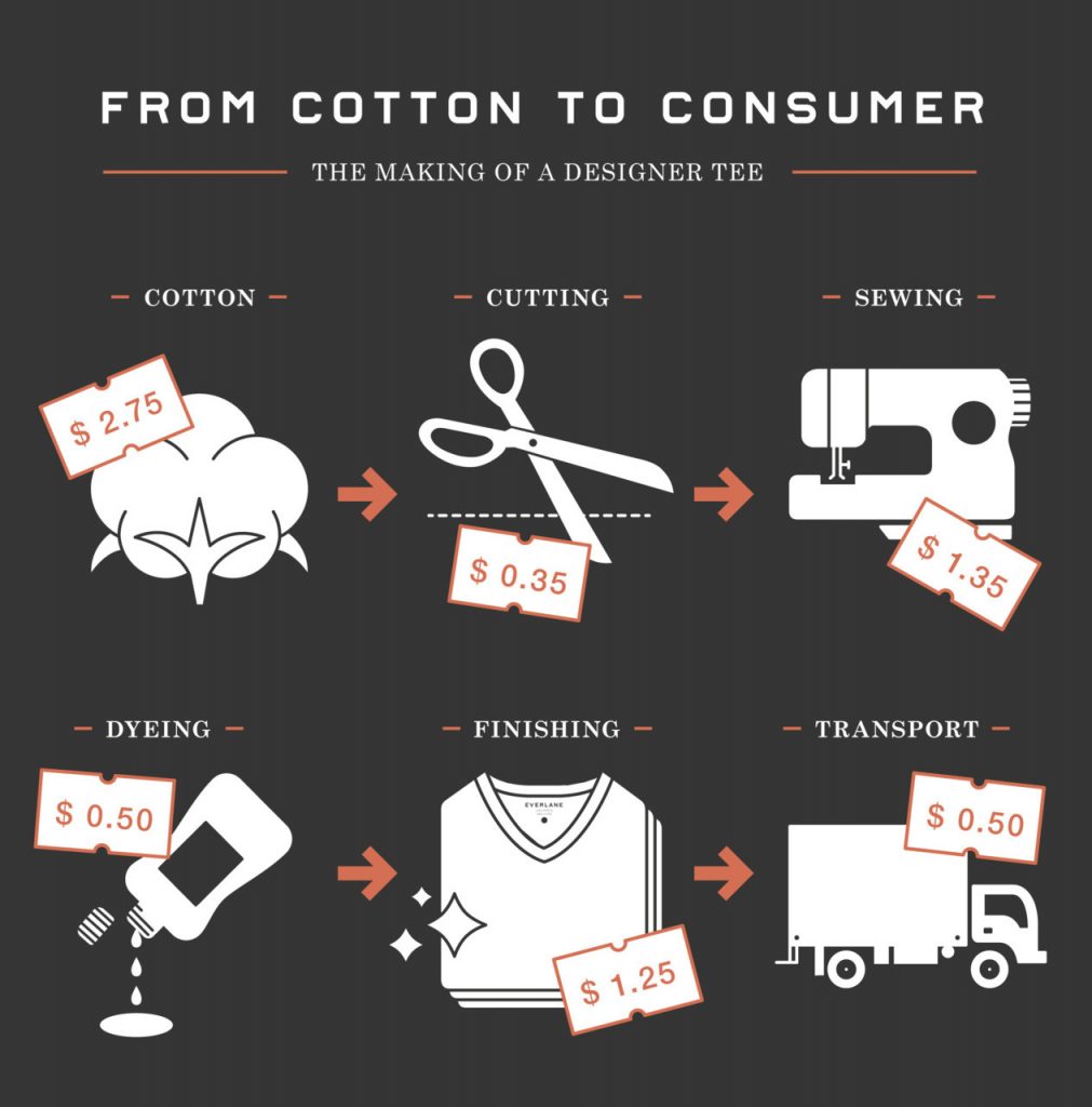
In 2011, Everlane created an infographic explaining why clothes cost more than they should. They walk you through the process of what it takes to create a basic t-shirt and how much each step costs. Then, in the second half of the infographic, they explain how companies mark up the price and how it’s sold to you at a much higher price than it needs to.
Report on data
Spreadsheets are boring. An infographic can take the same data and turn it into a meaningful story. Whether you need to report on progress, inform your boss, or do regular data visualization, infographics can be used to give a nice overview of where you are and what needs to get done.
Onboard an employee
Starting a new position is stressful and confusing. If someone is new in your organization and you want to give them a cheat sheet of how your company works, you can create an infographic for them to reference.

And much more. Whatever your goal is, it’s going to determine how you’re going to lay out the information in your infographic.
For our infographic, our goal is to educate people on how to best create an infographic. We’re doing that by creating a summary of this post that you can reference or send to other people.
Step 3: Gather your information
The next step is to make sure the information you gather supports your goal. This is the step where a lot of people get stuck. If the core of an infographic is meaningful information, where do you get the information from?
The first, and the most convenient place is your own company. Analytics, sales data, SOPs, all can give you plenty of data to turn into an infographic. Just make sure you have permission to use the data.
Sometimes you don’t have access to (or you don’t want to) use your company’s data. In that case, a good place to look for interesting data is Kaggle. Originally meant to provide data sets to machine learning and data science enthusiasts, you can find a whole range of data, from the top games on Google Play to basketball datasets or global warming.
Make sure you save the sources, though, because you’ll need them in your infographic.
One thing to take note of when gathering data is that less is more. It’s tempting to wow viewers with a truckload of data, but often this has the opposite effect. Instead of thinking it looks cool, people get confused and they leave. We recommend two options:
- Give enough data points to get an overview of a topic.
- Take one data point and explain it in depth.
If you try to do both you end up with a giant, unfocused infographic that confuses people.
For our infographic, since we’re making a graphic that summarizes this post, we’re using its outline as data.
Step 4: Choose a type of infographic
The type of infographic you pick determines the overall layout of your data.
There are a couple of infographic types:
- Process infographics
- Comparison infographics
- Timeline infographics
- Informational infographics
- List infographics
Each has its own specific way of displaying information. Comparison infographics will use a two-column layout whereas a list will have one column. Start thinking about how you’ll lay out the information so when you pick a template, you know what to look for.
For our infographic, since we’re talking about a process, we’ll use—you guessed it—a process infographic. We know we’ll have to look for a template that either shows processes or something we can use to show progression. A two-column layout like in a comparison won’t work.
Step 5: Create a logical hierarchy in your data
It’s time to bring some structure to the information you gathered in step 3. The reason you do it first is that it becomes hard to adapt once you’re working on the design.
I suggest creating the structure either in Word or in a Google Doc so you can have an overview and switch data around without much of a hassle. Trying to do that after you designed the graphic is a pain.
One thing that helps you create a more logical structure is to talk through your outline. Going through the structure you created and explaining it as you go along will show you where the gaps are in your argument. And because you’re still doing it in Word or Google Docs, you can still adopt it easily.
Since we’re working with the outline for this article, the structure won’t look much different from our outline. Here’s what we’re going to use:
Step 6: Pick and customize a template that fits your message
I’ll be honest with you: Unless you’re a designer, don’t design your own infographic from scratch. I know everyone likes to think they’re great at design, but unless you spent time developing an eye for it, you don’t know what looks good and what doesn’t.
A good design won’t make your infographic successful, but if your graphic has such a bad design that it starts to detract from the message, you’re in trouble. An infographic with a solid structure but an OK design will do better than a perfectly designed infographic that is all over the place.
That’s why I recommend picking a template and adjusting it to your needs. Our infographic templates are created by professional designers and are made to be customized. Besides, chances are you don’t have the time it takes to create it good infographic from scratch. You have a million other things to do.
Pick a template that roughly matches the structure you’re aiming for and adjust it to your need. At most, copy and paste parts, move them up or down, and change colors & fonts.
Let’s do that in our infographic.
Since we want to create an infographic that shows the process of making one, I’m going to look for a template that has the elements that I want. Since it’s a process, I’m looking for templates that either has steps in them or elements that show progression.
I ended up using this employee onboarding template we showed earlier. Although the template is about a different topic, it has the elements we want to create our infographic.
Now let’s adjust it to our needs.
Adjusting a template in Piktochart
Templates are a starting point for your graphic. They shouldn’t be used as a final image.
Adjust the colors, fonts, text, and images to make the template your own. It’s easy to do with our infographic maker.
Adjusting colors
Color impacts the tone of your infographic. Using bright, playful colors will give your infographic a… well, bright and playful look.
Keep in mind the goal and the message your want to communicate. You don’t want to use bright and playful colors when you’re talking about a serious problem.
First, we’ll adjust the color of the infographic. The pink is nice and all but it doesn’t fit the message we’re going for. Instead, I’ll look at the different color schemes available in the template.
When you click on them, the template will automatically update the colors.
If your company or brand has a specific color scheme, you can manually pick the colors you want.
If you don’t like the color palettes included in the templates and you don’t want to use your own brand’s colors, you can still use a tool like Coolors to come up with a good palette for you. Again, unless you have a good grasp of color theory, I advise you not to create your own color palette.
For our template, I’m using the Blue turquoise color scheme that’s part of the template’s built-on palettes.
Adjusting text & fonts
Just like colors, fonts have a big impact on how a message is perceived. Pick the wrong one and your message gets a whole new meaning. For example:
Finding good font combinations is an art in and of itself. I’m not going to go into detail here, but you can check out our other post about font pairing. Alternatively, you can use a tool like Fontjoy to help you out.
For our infographic, I’m going to keep the fonts as they are.
At this point, we’re adding our own text and we start to move some text around. As you can see, I changed a couple of things:
- Modified the headline and the subheader.
- Switched the headline and subhead so the subhead is at the top.
I also started adding my text to the infographic. I’m trying not to mess with the design too much at this point. I’m just trying to get all the text on it so I can focus on images, icons, and alignment later on.
Adding images and icons
An infographic with only text is boring, so you’ll need images and icons to spice things up. However, out of all the things you can change in a template, images and icons are the easiest to screw up. With colors and fonts, you can use tools to compensate for the lack of experience.
With images and icons, however, you’re messing with the whitespace and composition of the design. You can use the helper lines in Piktochart to snap elements into place and keep things aligned, but ultimately you have to decide whether something looks good or not. This requires some knowledge of basic design principles.

What images and icons to add depends on your message and what emotional message you want to communicate. Think of what would symbolize your message. A picture of a beach can represent vacations, a picture of a conference can represent collaboration, and so on.
But please (please!) avoid the overused stock photos. You know the ones, a customer support employee smiling at the camera, two guys in a suit shaking hands, or the very politically correct group of people who seem weirdly happy to be in a meeting.
For our infographic, I’m not using images at all. I’m using the built-in illustrations Piktochart has.
First, I’ll put in our logo and delete some of the illustrations that are already there. As much as I like them, too many will drown out the headline. I’m also replacing the illustration on the right with one that represents the message a bit more.
For the body of the infographic, I don’t like the numbers too much, so I’ll replace them with icons to represent each step.
To finish it off, I also replaced the bottom illustration with the same one we had at the top. And that’s pretty much it.
Once your infographic is complete, you can either download it as a PNG or a PDF and send it via email or share it on social media. If you added links to your infographics that point to other resources, downloading it as an image doesn’t make sense.
You can embed your infographic on your website. To do this, go to “share”, tick the box to make your infographic public, and click “view embed code”. This allows you to paste the piece of code on your website. If you’re using WordPress and want to embed it in a blog post, you’ll have to put the piece of code in an HTML block.
Here’s the infographic we created:https://create.piktochart.com/embed/53895704-how-to-make-an-infographic
Rinse, repeat
The beauty of using templates to create infographics is that once you created a graphic, you can reuse it over and over again. This is useful when you create reports or graphics that have to be updated regularly.
Tools to Create Infographics
Canva
Make an infographic in minutes, not months, with Canva’s easy-to-use infographic creator.
Create compelling infographics, fast
Make data beautiful—and easy to digest. With Canva’s free infographics maker, there’s no need to struggle with complicated design software. Simply choose an infographic template, add your information and there you have it: A stunning custom infographic.
Canva has an extensive range of templates and thousands of illustrations—meaning whatever your subject matter, you can bring it to life with our free and easy infographic creator.
How to make an infographic
- Get started with CanvaOpen up Canva and log in or sign up for a new account using your email, Google or Facebook profile. Search for “Infographics” to start designing.
- Select a templateExplore Canva’s wide range of infographic templates for your visualization needs. Use the search tool to narrow down your choices by theme, color, style and more.
- Customize your infographic designBegin with a template and branch out in any number of creative directions. Change the text, colors, fonts and backgrounds with just a few clicks.
- Perfect your design with elementsBrowse our immense library filled with millions of images, illustrations and graphics. Find thousands of arrow designs for your flowchart and arrange them any way you like on your design.
- Save and shareHappy with the result? Download and save your infographics as a PNG, JPG or GIF file. Share it on your social media, embed it into your website or print it for handy reference.
Infogram
Infogram is an incredibly powerful visualization tool. But the free plan has limited export options. It only lets you embed the infographic on your blog, along with the Infogram watermark. You can’t download the infographic as an image or a PDF.
If you’re okay with this limitation, sign up for an Infogram account and start making an infographic by creating a blank canvas or choosing a template. Use the left sidebar to navigate through all the available templates for charts, text, and graphics. With a single click, you can import a chart. Then use the right toolbar to add data, edit the styling, and finalize the placement.
Infogram’s templates are quite basic. Infogram is best used as a data visualization tool. If you run a blog, creating visuals such as animated or interactive charts, and then embedding them in your article text can be a good way to engage your audience.
Of course, you can use other tools to make charts—here’s how to make a chart in Excel, for example—but Infogram gives you the ability to create visually striking interactive charts simply by entering the required data.
Infogram’s $19/month plan lets you create private projects, download images, and access more than 100 premium templates.
Venngage
Like many of the services on this list, Venngage offers more than just infographic design. They have 12 infographic categories to choose from, including everything from geographic, comparison, informational, and “fun data.”
They also have 14 chart categories including editorial, mixed, word clouds, scatterplots, and Venn diagrams. When you sign up for an account, Venngage asks you questions about your business and design preferences and then recommends layouts for you. They provide a short guided tour in the editor, as well as video tutorials.
Venngage premium plans are similar to their competitors. Features include team functions, brand identity features, and access to more templates.
Mind the Graph
Mind the Graph is an infographic-making website designed for a community of researchers and scientists, but its use is open to the public.
The website offers over 3,000 scientific illustrations and infographic layouts that can be customized as needed. Unfortunately, free users are not entitled to use infographic templates from Mind the Graph. This means you’ll need to design your infographic from scratch.
Pictochart
Piktochart is a great choice for creating different types of infographics. You can choose from several different formats including traditional infographic sizes (vertical), PowerPoint sizes (horizontal), posters, and reports.
Creating infographics on Piktochart is fairly easy. You’re also given the freedom to create your own infographic from scratch or choose one of their templates. Some of their templates are free and others require you to have a Lite or Pro plan).
Visme
Visme is a service that is still relatively new. This tool gives you options to help you create presentations, animations, mock-ups, banners, and of course create infographics online.
After you log in with your account, the screen will show all the visuals for all the projects you have done. This screen will be blank if you have never created any project. You can start by clicking “Create New Visme” to get started.
After that, you can choose the type of project you want to do. Of course, since it’s about infographics, you choose infographics. you’ll notice that there are some free templates you can use. Some templates can only be used if you’re using a premium account, you’ll then be able to design your infographic with a variety of tools available. Visme even allows you to animate an object.
Visually
Visually is a creative community where collaborate over 1,000 freelance designers. Besides infographics, you can create ebooks, videos, presentations, and interactive websites too. About infographics, Visually offers a wide set of models focused on different areas such as Communication, Marketing, Business, Health, or the Environment. It provides a huge portfolio in which to find inspiration for your projects. Although it has a free version, Visually also provides payment services related to the creation of visual content, with special discounts. for companies. For use, you need to create an account.
Easel.ly
An entertaining app for creating computer graphics easily. It is a very intuitive tool for creating visual projects with just dragging elements to the canvas. Easel.ly has a variety of themes and icons categorized. Its strength: simplicity. The tool makes the process of visual creation in a game for children, perfect feature for beginners. In addition, you can also create and share your infographics. In the free version only have fifteen templates available.
Hohli
A more minimalist app that focuses on creating simple graphics similar to those found in a Word document. The design is quite similar to the graphics offered by Google Public Data Explorer. Hohli can choose different types of charts as lines, bar charts, pie charts, Venn diagrams, scatter plots or radar charts. One of the most significant aspects is the choice of the size and orientation (vertical, horizontal or Square). Perfect for presenting data in a sober and schematic way, unadorned to deflect attention from content.
iCharts
An application exclusively focused on creating graphics. It has a visual-based analytics platform in the cloud, allowing the visualization of complex data quickly and dynamically. One of the main features in the collaborative activity of users. iCharts covers three main areas: Business, Media and Research. It has a streaming chat to resolve doubts. Despite a sober appearance, it is the best solution to present complex information in a dynamic way. For use, you need to create an account.
Conclusion
A well-crafted infographic can be a powerful tool for marketing your business or educating your audience. It’s more than just a pretty picture! Being able to explain ideas quickly and visually is important, whichever field of work you’re in.