Have you ever wondered about how to create line graph in Microsoft Excel? Or format the position of line graph in excel? If your answer is yes, this article can help you.
As one of the most useful business tools, Excel has more advantages than you can imagine. To date, Microsoft Excel remains an important tool for businesses and professionals to analyze large data areas. For many users, graphs play a very important role in statistics analysis. Therefore, if you are looking for how to create line graph in excel, you’ve come to the right place.
Excel makes graphing easy. Line graphs are one of the standard graph options in Excel, along with bar graphs and stacked bar graphs. While bar graphs may be best for showing proportions and other data points, line graphs are ideal for tracking trends and predicting the results of data in yet-to-be-recorded time periods. And although line graphs are useful for forecasting data, they can also be misleading — if the creator doesn’t plot the data correctly, the graph may exaggerate the data to look better or worse than it is in reality.
Read on to learn how to create a line graph in Microsoft Excel, the main components, what they are and aren’t good for, how to read them, and how they can be misleading. You’ll have all the information you need to start creating line graphs in just a couple of minutes.
Table of Contents
What Is a Line Graph?
A line graph (also called a line chart or run chart) is a simple but powerful tool and is generally used to show changes over time. Line graphs can include a single line for one data set, or multiple lines to compare two or more sets of data.
The essential components of a line graph are the same as other charts. They include the following:
- X axis (Horizontal Axis): On a line graph, the X axis is the independent variable and generally shows time periods.
- Y axis (Vertical Axis): This axis is the dependent variable and shows the data you are tracking.
- Legend: This section provides information about the tracked data to help viewers read and understand the graph. A legend is most useful when a graph has more than one line.
- Plot Area: The space on which the data is plotted.

You can change the scales of each axis to better illustrate the facts. However, too much manipulation can be misleading. For more about this, read the section below titled “How Line Graphs Can Be Misleading.”
Another variation of a line chart is a timeline graph. Unfortunately, creating one involves some special features (such as the ability to zoom in or out and compress the timeline) that are not available in Excel.
Additionally, note that line graphs aren’t suitable for all kinds of data. For example, they don’t do a good job at demonstrating proportions. Instead, consider a pie chart or stacked area chart.
Part 1: Creating a Line Graph
- Open Microsoft Excel. Double-click the Excel program icon, which resembles a white “X” on a green folder. Excel will open to its home page.
- If you already have an Excel spreadsheet with data input, instead double-click the spreadsheet and skip the next two steps.
- Click Blank Workbook. It’s on the Excel home page. Doing so will open a new spreadsheet for your data.
- On a Mac, Excel may just open to a blank workbook automatically depending on your settings. If so, skip this step.
- Enter your data. A line graph requires two axes in order to function. Enter your data into two columns. For ease of use, set your X-axis data (time) in the left column and your recorded observations in the right column.
- For example, tracking your budget over the year would have the date in the left column and an expense in the right.
- Select your data. Click and drag your mouse from the top-left cell in the data group to the bottom-right cell in the data group. This will highlight all of your data.
- Make sure you include column headers if you have them.
- Click the Insert tab. It’s on the left side of the green ribbon that’s at the top of the Excel window. This will open the Insert toolbar below the green ribbon.
- Click the “Line Graph” icon. It’s the box with several lines drawn on it in the Charts group of options. A drop-down menu will appear.
- Select a graph style. Hover your mouse cursor over a line graph template in the drop-down menu to see what it will look like with your data. You should see a graph window pop up in the middle of your Excel window.
- Click a graph style. Once you decide on a template, clicking it will create your line graph in the middle of the Excel window.
Part 2: Editing Your Graph
- Customize your graph’s design. Once you create your graph, the Design toolbar will open. You can change your graph’s design and appearance by clicking one of the variations in the “Chart Styles” section of the toolbar.
- If this toolbar doesn’t open, click your graph and then click the Design tab in the green ribbon.
- Move your line graph. Click and drag the white space near the top of the line graph to move it.
- You can also move specific sections of the line graph (e.g., the title) by clicking and dragging them around within the line graph’s window.
- Resize the graph. Click and drag one of the circles on one of the edges or corners of the graph window in or out to shrink or enlarge your graph.
- Change the graph’s title. Double-click the title of the graph, then select the “Chart Title” text and type in your graph’s name. Clicking anywhere off of the graph’s name box will save the text.
- You can do this for your graph’s axes’ labels as well.
How to Create Line Graph in Excel With Pictures
1. Select the range A1:D7.
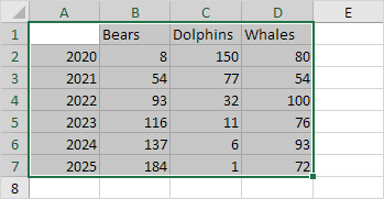
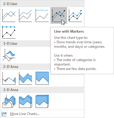
2. On the Insert tab, in the Charts group, click the Line symbol.

3. Click Line with Markers.
Result:

Note: only if you have numeric labels, empty cell A1 before you create the line chart. By doing this, Excel does not recognize the numbers in column A as a data series and automatically places these numbers on the horizontal (category) axis. After creating the chart, you can enter the text Year into cell A1 if you like.
Let’s customize this line chart.
To change the data range included in the chart, execute the following steps.
4. Select the line chart.
5. On the Design tab, in the Data group, click Select Data.
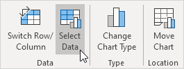
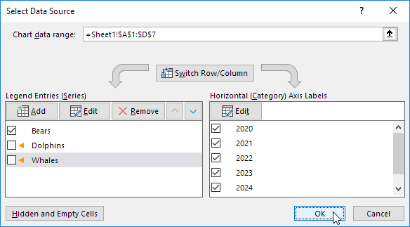
6. Uncheck Dolphins and Whales and click OK.
Result:

To change the color of the line and the markers, execute the following steps.
7. Right click the line and click Format Data Series.
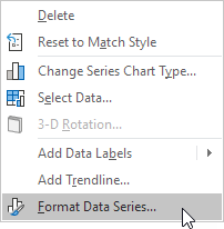
The Format Data Series pane appears.
8. Click the paint bucket icon and change the line color.
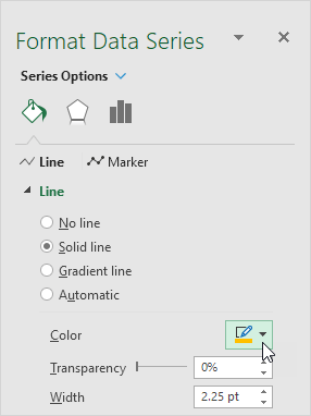
9. Click Marker and change the fill color and border color of the markers.
Result:

To add a trendline, execute the following steps.
10. Select the line chart.
11. Click the + button on the right side of the chart, click the arrow next to Trendline and then click More Options.
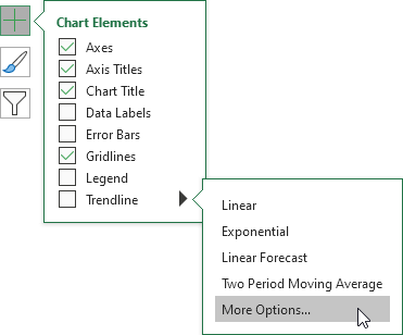
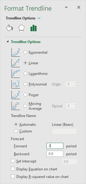
The Format Trendline pane appears.
12. Choose a Trend/Regression type. Click Linear.
13. Specify the number of periods to include in the forecast. Type 2 in the Forward box.
Result:

To change the axis type to Date axis, execute the following steps.
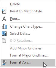
14. Right click the horizontal axis, and then click Format Axis.
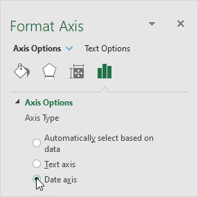
The Format Axis pane appears.
15. Click Date axis.
Result:

Conclusion
With the right kind of graph, you could easily visualize the comparisons between data sets. With the wrong one, it will make things look confusing and not easy to understand at all. That’s why you should be very careful when creating a line graph in Excel .
